COMPANY LOGO
Our logo is a unique, easily recognizable mark of who we are as a brand. A clean and modern design, it was developed in conjunction with our agents, delivering a strong graphic statement that emphasizes our brand values.


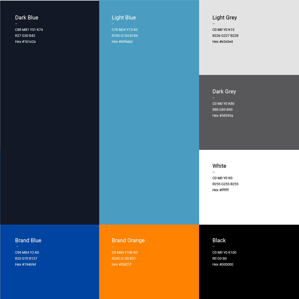
COLOR PALETTE
The primary color palette is a very important brand element as it helps to tie-in all of the elements, assets and templates.
TYPOGRAPHY
Typography is an essential tool in the development of a brand identity and is a key element to create a distinct and cohesive look across all communications.
Our chosen font, Roboto, is clean, modern and well suited to a wide range of applications, particularly digital.
Roboto font family
ABCDEFGHIJKLMNOPQRSTUVWXYZ
abcdefghijklmnopqrstuvwxyz
1234567890.,:;?!
Aa
The quick fox jumps over the lazy dog
The quick fox jumps over the lazy dog
The quick fox jumps over the lazy dog

BRAND DESIGN SYSTEM
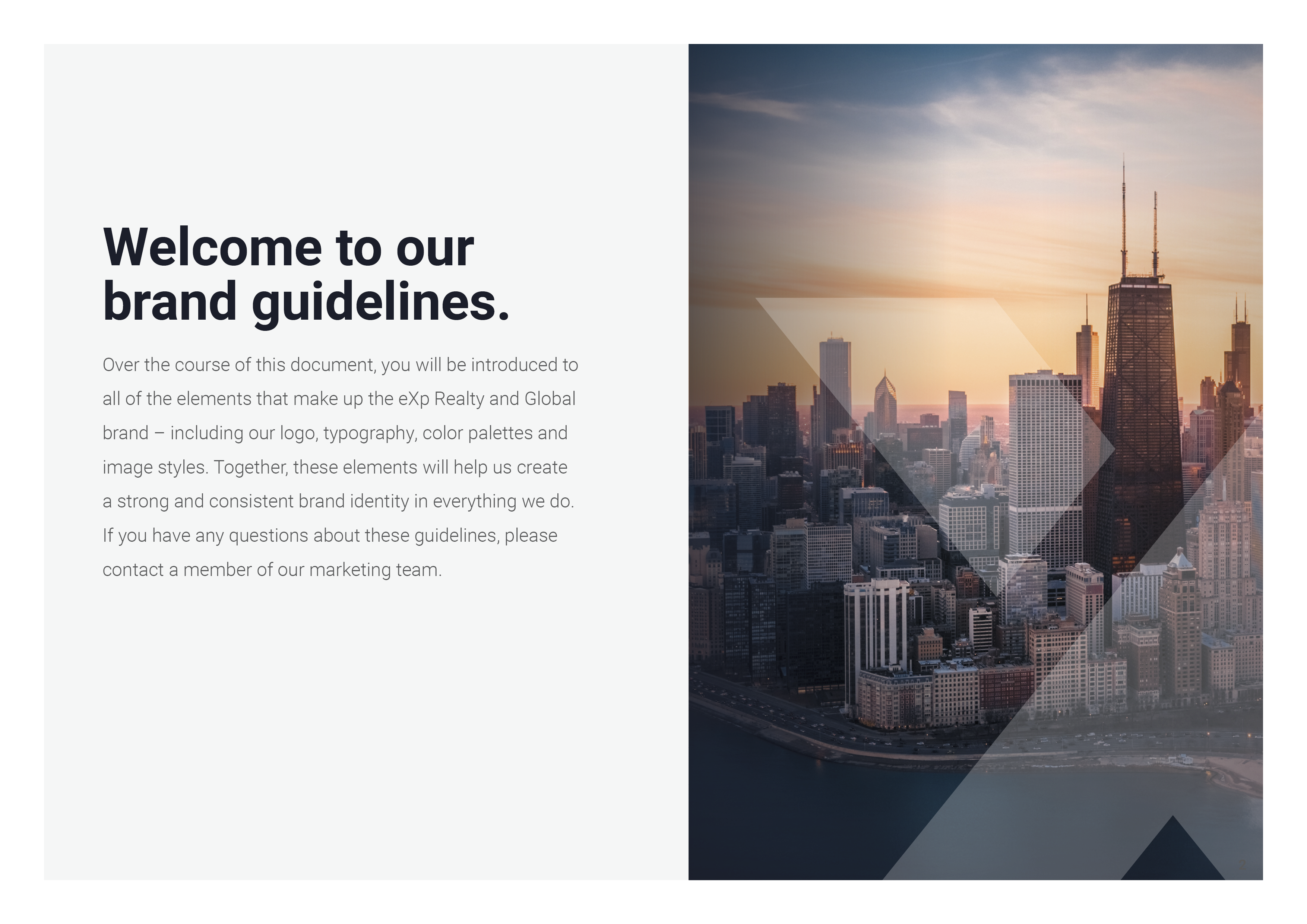
Over the course of this document, you will be introduced to all of the elements that make up the new eXp Realty brand – including our logo, typography, color palettes and image styles. Together, these elements will help us create a strong and consistent brand identity in everything we do. If you have any questions about these guidelines, please contact [email protected]
